Matthew Smith: Another happy Friday to you, Matt Helbig.
Matt Helbig: What's up Matthew Smith? What's up Email Geeks! Welcome back to another Feedback Friday!
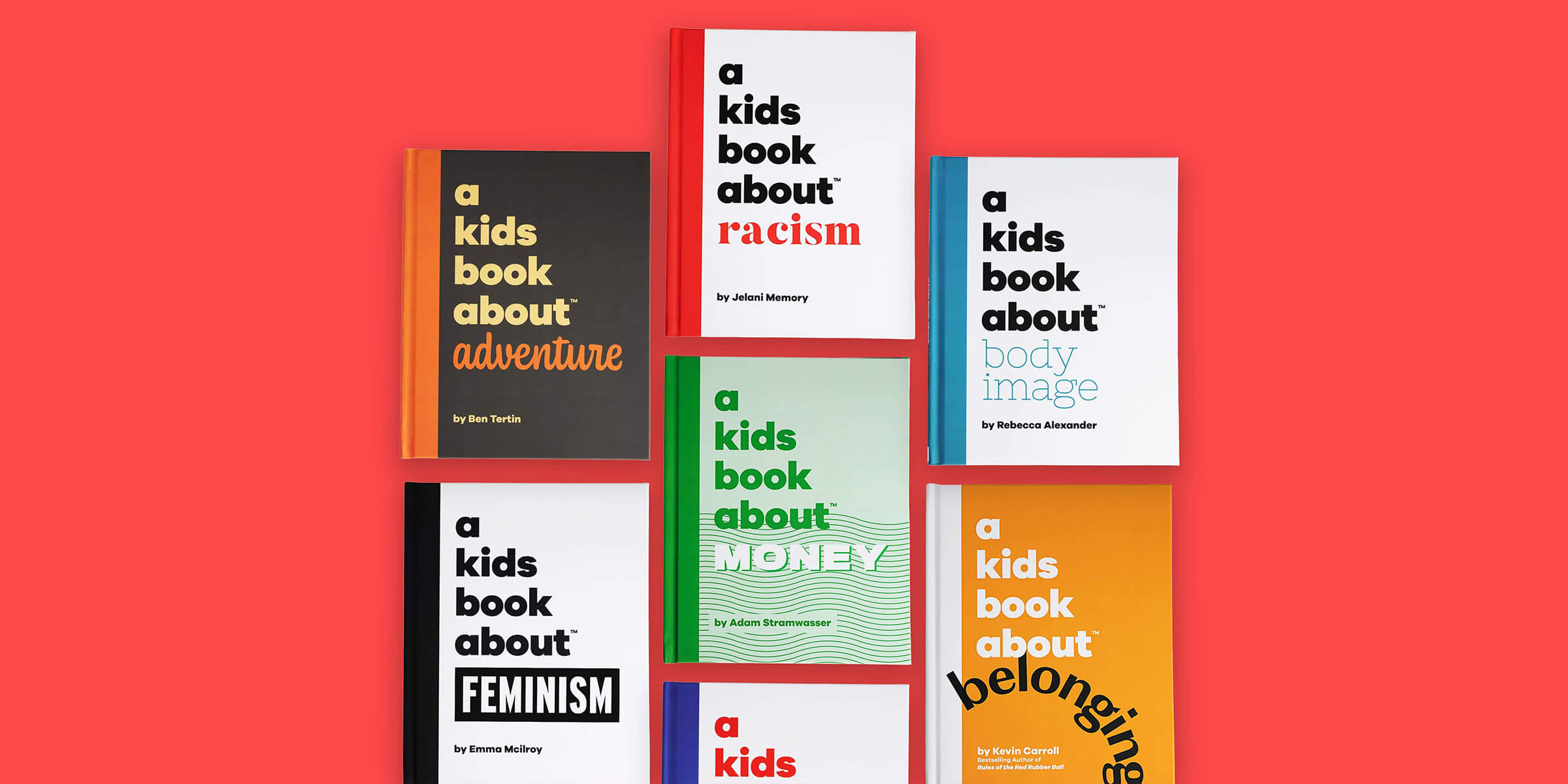
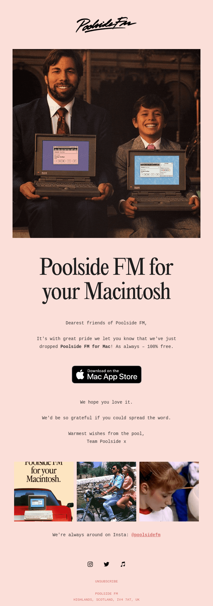
Matthew Smith: It's good to be here, my friend. Good to be here. Hey dude, I am a family guy. I've got three kids, and so this brand caught my eye recently. This is A Kids Book About, and they've got kids books about everything, and it's awesome.
You can see down here they've got kids' books about racism, belonging, creativity, feminism, depression, money, cancer, body image, anxiety, gratitude, adventure, failure. Pretty awesome stuff. I'm ordering these books for my kiddos and I've got a little eight year old girl, and I think this is perfect for her.
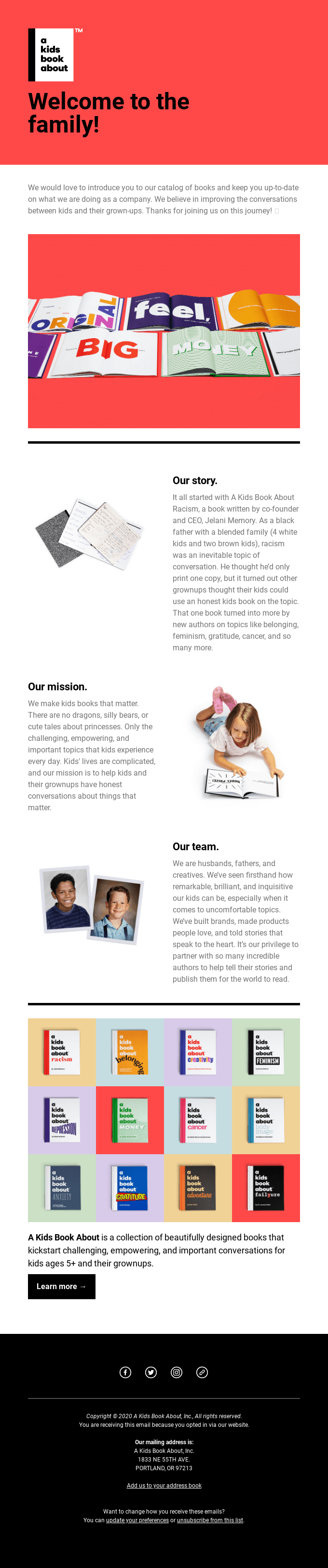
My boys need something a little bit more advanced, but this is just great for young kids. Their emails are a great example, I think of a really standardized template simply done in a fantastic way. So this is actually a really pretty basic template that they've just used really smart photography on. So if we go up top, this is a header image, probably with a background color over on this left side, and they've just chosen to left align this part.
They've got their text here in a basic font that's available on your system, and then they've got their logo. They introduce with just a normal body text, which in this case works, especially because they lead with this image. So it kind of has the right balance. They get this fantastic imagery in there that draws this color down into the next part and already I'm like, Whoa, what's, this is cool.
I want to see these things. I see these, this big type, and I'm interested, I can read a little bit about the story, and I can see this imagery that accompanies this paragraph and in a really nice, simple way, right? It's nice and white background and just illustrates what's going on. I don't need to know what's in this image. It just kind of feels like "Our story".
And then "The Mission" and you start seeing the mission is related to the kids. It's about people. And that feels good, right? And then you get this sense of who the team is made up of. And it's these cute little kids together that maybe are adults now and it feels fantastic.
And then you get this full exposure of all these different books, feeling really colorful, so many titles and things to look at. And then you can learn more. I think they've done a really nice job in this. They finish it off with a centered footer. I think that works.
They have these social icons. So the critiques for this email for me are I think that maybe you could lead up here with some larger intro copy to kind of create something that you can read very easily, especially from a distance that kind of catches your eye and really gets in there quickly. That would feel like it accompanies this lead image.
And then I think the other thing I would do is there's no CTA here, why isn't there a CTA? Go check out our books right here. I understand they'd probably want to lead people down through the imagery, but I think there's a real opportunity to put a CTA there or to put a CTA even on the image. Maybe they have a video on their site and they could show the video there.
Lots of opportunity up top and then this "Learn more" as a pretty soft CTA, soft action. I think they could definitely follow that up with something a little bit more specific, like buy three of our books and get the fourth free, or some discount or something and then the button for some reason is a little tight there. It needs a little bit more space.
We've talked about social icons a bunch. I feel like this is just saying we are on Facebook, Twitter, Instagram, and link I think means website probably, but that's just a convention that has been like held over. I've put them in emails before and the more that we talk about it, it just doesn't serve the customer very well.
So instead, why not show a little bit of content from Facebook or show a little content from Twitter or from Instagram? That way you're giving somebody a taste of what they can get there and they're much more likely to engage The information there is fine. I think that it's nice to have that in a footer i suppose. I have yet to ever get an address from somebody's email footer, but I suppose that's just a convention that has been passed down.
Matt Helbig: That's for CAN-SPAM Act compliance. You need a valid postal address to be in your message.
Matthew Smith: See, I'm all about the design, not about the protocols. Well, there you go. There you have it. Thank you for being the expert in that space, Matt Helbig.
Matt Helbig: That's what I'm here for.
Matthew Smith: That's awesome. Yeah. What's this unsubscribed link? They don't need that. I'm showing my true colors there, but from a design perspective, from a serving the customer perspective, they do a great job. And yeah, I've been happy. What do you think Mr. Helbig?
Matt Helbig: Just from that footer, this email is probably a MailChimp template.
Matthew Smith: Yep. That's what I was thinking.
Matt Helbig: I think they do a really good job of using color and using imagery to really spice up this basic template. I am curious about this Z pattern in this email.
I feel like it's something that I even struggle with as an email marketer to really include that. I feel like it's something that I tend to stay away from. So I'm interested what you think about including a Z pattern in your email and how it works on desktop and mobile.
Matthew Smith: So a couple of thoughts there, and I'm glad you brought it up. So it works here in particular because there's so much white space. So if these were filled in and really blocky. It's too much and your eye is like bam, bam, bam, having to move really hard. Right now the imagery just adds to it. It's small and it gets out of the way, but we're really focused on, these content blocks and that really helps a ton.
So being able to have. Just that white space, that's a priority. So if you're going to do that, make it something that's interesting. Like if these were just icons, boring, not helpful, like one color icons, but if they're like little illustrations or or pictures like this, it works really well and I think that's fine.
Now, one thing that I would say over here on mobile that could be better is they have "Our story" and it makes sense why they have so much padding here because of the image they had to use over here. But honestly, it should be closer. And then you come down here and "Our story" feels related to this little girl, but really that's supposed to be related to "Our mission".
So you want to create connection between an image and its content, right? And that's missing here. It works here. But then here you're like, wait, which image belongs to which? The spacing is too similar to what you call an uncanny valley where you're not quite sure which one it belongs to, and so that's something you want to solve for it.
That's a real nit-picky thing. Again, one of the values why I think this email is doing a great job is they took a very basic template. And they made it really work. So this is a good example of being able to operate within tight constraints and make something amazing.
Matt Helbig: Well, I'm a big fan of this one. Thanks for sending it over.
Matthew Smith: Sweet. All right, well, don't forget to get your butts to UNSPAM this year. It's March 12th and 13th in Greenville, South Carolina. You can check out information at unspam.reallygoodemails.com we'd love to have you there. Last year was an amazing event, with just so much good feelings for everybody all throughout. Can't wait to do it again this year.
Dive into the world of unmatched copywriting mastery, handpicked articles, and insider tips & tricks that elevate your writing game. Subscribe now for your weekly dose of inspiration and expertise.
Curated Weekly Reads
Receive the crème de la crème of email designs and thought-provoking articles directly to your inbox, twice every week.
100% Quality, No Spam
We promise to only deliver value-packed emails, no fluff or spam. Your trust and satisfaction are our top priorities.