So you had that layout, and then once the content gets into the grid, it re-stacks and takes advantage of the grid system to look good on mobile.
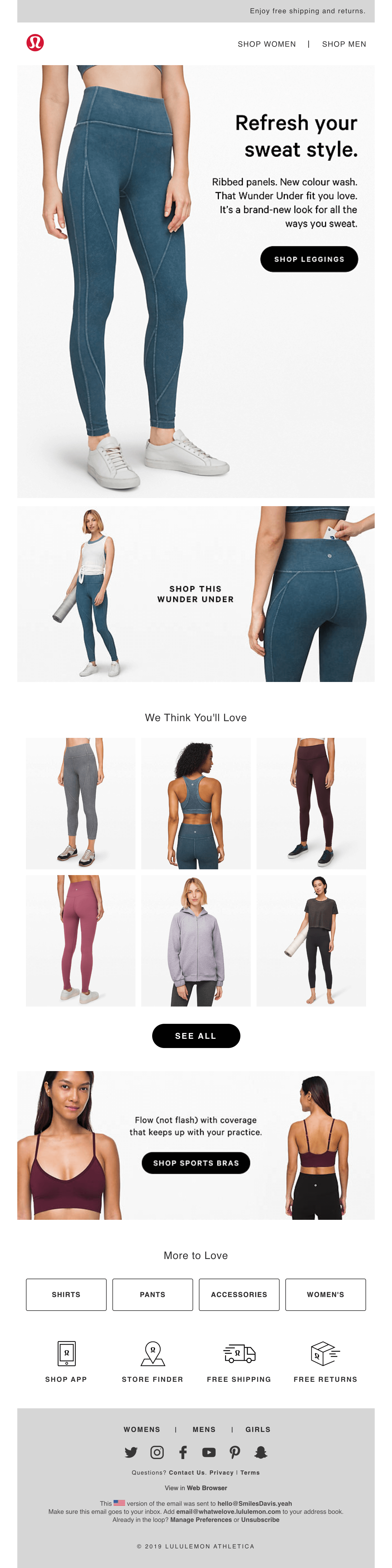
Annett: There is a couple of things happening. The hero image is two different images.
Matt: I like it when brands optimize a bit more for mobile. It does take a little bit of extra work, but it pays off. You can tell the difference between these two.
Annett: It's, of course, only working on any device that supports media queries because the mobile version is a background image that is always lying behind the desktop.
The container that is holding this background image is optimized for the actual image. So on iOS or everywhere else where media queries are supported, the desktop image would be hidden.
Matt: Looking at that original template where there was a little more live text, why did they decide to lock up this text in images. I guess it makes sense to lay it out in a specific way and use some of these brand fonts.
Annett: They were focused on brand fonts, of course. And then it also depends on the object itself. I mean, these are leggings, so this is a vertical image, so some people might think we could use a background image, but I'm hesitant if it's a hero. If it's a pattern, we can live without, because some Samsung native apps don't support background images.
If it's a hero, that is important. I would not like to miss that picture. If it's a background pattern that I could replace with a background color, then okay, that's fine. But that's the reason why I don't suggest background images on a hero. In retail or fashion, we see that brands style guides are essential.
If this is the number one goal for the client, I will have to live with it. I want more text myself. In some emails, we do it, and in others, we don't.
Matt: It does look like this one does sort of mix in some live text when possible. So that looks great. But you're right. I think having a separate layout for mobile and desktop gives you a lot more control. The tradeoffs are that it's a lot harder to know how something might scale 100% of the time on some of those older clients.
I think you're right in this case where the better experience, honestly, is just having this laid out in an image. So scrolling down, I'm interested in the difference between these two images.
It's an interesting switch up from desktop to mobile. So how difficult is some of this stuff? Is it just showing a specific image on desktop and then hiding it and showing this one on mobile?
Annett: It's the same as the hero. The background image is always behind. So the mobile version is the background image in this case. And because I can use a background image on mobile because it will only work where media queries are supported. And this is where background image rules show. So I'm not concerned about a background image in this case. The designers prepare a mockup for the desktop version and a mockup for the mobile version..
And then we have two images. They are sitting in the same table cell, but sitting on top of each other. So the desktop is on a higher level, and right below is the mobile version.
Matt: I think I've never really seen it done like that. I've always seen sort of hiding an entire table row or something and then showing one on desktop or mobile, but I like that approach.
Annett: The only thing that you have to watch out for that the images are optimized because you're loading both. Like if you do this in an email, then will basically, you're asking for a lot of download data.
Matt: This is almost two emails in one
Annett: So I would be cautious about it.
Matt: This one does feel very mobile-first, and this one feels excellent on desktop. I know many people are moving towards the mobile-first design, but having this desktop, especially with the number of people I assume they might have opening in Gmail or something, makes sense to focus on this layout.
So scrolling down, I liked this grid system. Each of these are individual images, which I enjoyed. And this mobile section looks great. Can you talk about maybe how that stacks or moves around?
Annett: Yeah. So this is just a switch up. Maybe we want to emphasize certain products more than others.
In this case, I would suggest using the first image in the first row, and the last image in the last row to put the item in that needs more attention. So it looks like this first row is a three-column. But it's not. It's two columns.
The first image, the gray leggings, is one column, and the other two images are in the same cell, but nested in another table.
Matt: That's a genius move.
Annett: The first image will scale up 100%. As soon as the screen size becomes smaller. And the other two images will scale and stay the same size.
Matt: So is that something that a designer might have asked for, and then you're trying to find a fix? Or is this something that you know you can do, and then you kind of relay that to the design team?
Annett: In this case, they had that in one version, in their older templates, but it didn't work correctly. And then I worked on it as long as I got it to work. That took me a little bit.
But, it worked out in the end, and I was very proud of myself after I managed that, and then I couldn't stop playing. So I made a whole set of different grid systems, like, how could I change this and make this completely different? So I went little nuts with that.
And now, I have a massive library of wireless grid systems. I suggested a few different ones because sometimes, one of my clients is Article right now. It's a cool furniture company based in Vancouver, and they have a lovely Scandinavian look.
Matt: We love their emails too.
Annett: Yeah, I'm on that too. So, there's going to be some new emails coming, but they have so many different items on the website. They have different sizes. Like a chair can never be the same size as a couch. The same thing I had a Grand & Toy. They're selling office supplies. It goes from a razor to a chair.
So the dimensions of certain items can vary so much. So if you have a grid system that allows you to show items in a different size and still make it look good, you will have to have a little closer eye on it. What item you put in, what position, of course. So it's not ideal for if you were loading your images dynamically.
You do need a little bit of a control over this. But it could help to balance the layout out of an email that has a lot of different items in it. So I think therefore, this was a really fun thing to do.
Matt: I liked this solution because having that three columns scaled down would be too small on mobile, and then stacking them one on top of each other might make this email too long. So I think this is a really good middle ground for letting the grid live and only having to load in one set of images. So that's nice. And then when this bottom section, I was surprised just how different they look, but I guess they're different images.
Annett: It's the same thing as the hero. They did use this in this email they use three times. So it's a bit on the heavy end. But, it does look stunning.
Matt: I liked just how consistent the CTA sizing is. And I feel like a lot of brands scale stuff, and then everything kind of looks different sizes and the buttons kind of feel all over the place.
But overall, these CTAs feel close to the same sizing on both desktop and mobile. And when you're moving around all that content and scaling stuff, it just is nice to see that.
Annett: This is the result of designers and copywriters and developers working very closely together. So we had looked at each other's work and understood what everyone's priorities were.
You come to really good results in the end, if everybody cares about what limitations are and what possibilities are and what the priority of the brand is.
Matt: If you can have that design consistency be a big goal, it pays off when people spend that extra time caring about stuff like that.
It makes the whole experience feel a lot better. And then when you hit the website, and everything looks the same as the email, it's just a really good experience throughout.
Annett: I agree. All right, so the super footer. It's a bit big, I know. It's just the information was required. So then the menu itself, we wanted to have these items as large as possible.
It's clickable. It's click friendly on mobile because mobile is where the open rates are the highest. Higher than desktop. So I created these buttons for these four categories. This section is for anybody who hasn't found an item inside the email they want to buy.
There's extra information about shipping and what the return rules are, a bit more convincing that this is a good brand to shop with. So I believe these button radiuses even work on Outlook because it's a static button.
The buttons you see above with the rounded corners. I don't think that works on Outlook because it has padding, so it grows with the copy in it because, in this case, the copywriter needed to freedom to make copy that they'd come up with, and the button should work out for that. But in the menu, on the footer, the words don't change. They stay.
I can create a fixed button size, and I needed that because I'm stacking them again. It looks like a faux column, but it's not. It's a two-column with two separate nested tables in it. That's why they stay nice and flush. It's the same module underneath where the icons are with the app, the store finder, and free shipping.
This is the same module only that there's an image in it and a text link, and both are clickable, I think. Yeah, so the icons as well as the billings.
Matt: I liked this approach because I feel like in that hero section, you have this little mini navigation, but you get out of the way quickly.
I think these links are still useful. Having everything kind of that catchall footer in the bottom is probably the best way, as you said, definitely a mandatory thing. So I still think all these links sort of make sense to me. I think the only thing I might change is because these are live text, there might be like an opportunity to add some hover effects here or use this red in the logo somewhere else in the email. I feel like this pops, and I almost would want it to be incorporated into one of these potentially. I think that might be fun.
Annett: That's a design decision though usually so I don't.
Matt: True. You just set up the template and walk away. I think this base is very good, and the modules that you've built provides them a lot of freedom throughout these templates. So is there any other changes, or are you still working with them? Do you want to make any other updates? Like how hard is it for you to make new modules and things like that?
Annett: I have pretty good frameworks by now with the modules that I have.
So I always start with a base master template that I regularly maintain and test. I think they're pretty happy. They have tested this template for a long time. I was waiting cause like when would you finally use it? And finally when it came in, I was like, Oh my God, it is a winner.
Because they wouldn't have implemented it if it wasn't giving better results than the previous one. That's the moment when I'm most happy. That's actually the template is a winner and writes the numbers that the brand was hoping for. So I'm always happy then.
Usually, brands come back to me when some email client changes something and something breaks. Or they lose some staff or staff changes, and they need a new intro, because we have documented everything as well, that I tried to help with that as well. I'm making everything scalable and making everything or thinking of the next employee who needs an onboarding and needs to know how to code, handle the code, how it's done, and where it's stored. And what to do, what not to do.
That's becoming a workflow for me because jobs are sometimes repeating, especially when my template jobs come in.
Matt: You're very popular, high demand.
Annett: But usually when I do templates, I don't see a brand in a very long time.
Matt: Maybe that's a good thing.
Annett: I think so too.
Matt: You figure everything out and they have the tools to go out there and start testing things. Well, thanks so much for taking the time to look at this email. I really liked this, and I think there's some really smart design things that are done with some smart coding.
Annett: Thank you! Thank you for having me.
Matt: Where can we find you online? EmailBoutique still to be announced or coming soon?
Annett: There's an email form on, you can sign up if you wish. I'm on Slack EmailGeeks. Women of Email. Of course, and Facebook and I most of the time I'm online. If I go on vacation, I never go anywhere where there's no internet.
Matt: You have the best out of office email ever too.
Annett: I should get back to this. Yeah!
Matt: You need to take more vacations, I think.
Annett: I don't, I don't take any.
Matt: Okay. Well, have a fantastic weekend!
Annett: Thank you. You too, Matt.
Matt: See ya! ✌️