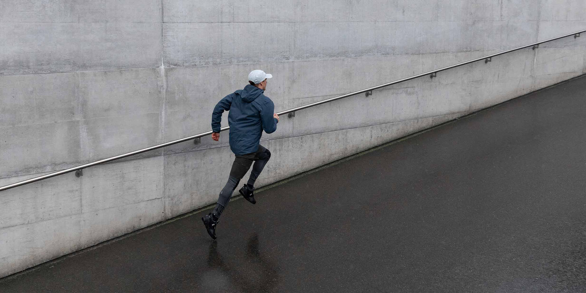
Matt Helbig: I think in some of their other emails they have some nice little hover effects. So I even think something like this where if you could add like a little zoom transition or something on these, they can maybe pop out a bit more. That might be fun.
I like the layout from desktop to mobile. I think the stacking is pretty nice and then using the same kind of color throughout. Down here transitioning the section a bit into some different products.
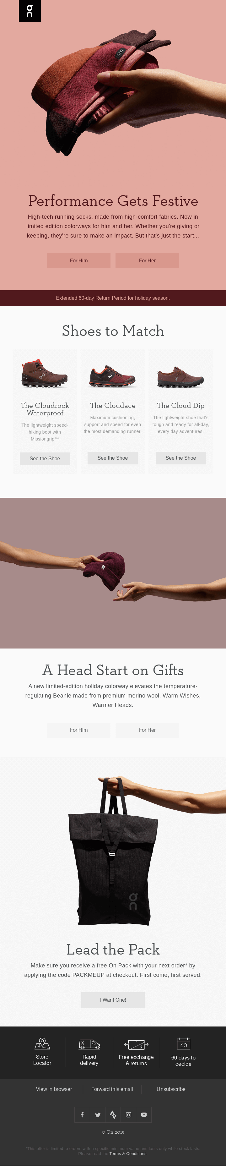
Sam Sexton: I think these icons at the bottom here are really good. Store locator. Great if people are trying to look for the in-store experience. 60 days to decide. I'm not sure what that is referring to. Does that make sense in the context of other emails?
Matt Helbig: I think it means that you get to keep your shoes for 60 days and if you don't like them, I guess you can return them or exchange.
Sam Sexton: Right. Okay. I love having stuff at the bottom.
Matt Helbig: This is a busier footer, but I think them sort of paring it down on mobile makes a lot of sense. I'm interested in why they hid the social icons here.
Sam Sexton: From my experience, social icons don't tend to get a huge amount of traction, so it kind of makes sense why they would hide them a little. Surprised that they've got "Forward this email", because in my experience it seems to be we're sort of moving away from the forward to a friend.
Matt Helbig: You're not forwarding emails to all your friends, Sam?
Sam Sexton: I can't remember the last time I forwarded a personal email.
Matt Helbig: I guess "view in browser" is useful if you want to share that link. But, "forward this email", I feel like people just end up forwarding it and it being so low on the bottom. This could be a customer support email instead rather than a "forward this email".
Sam Sexton: One other thing I would say is that I think it's clear that they've put a lot of work into the design of their emails to make the template modular. So I think a lot of the things we're seeing here will be replicated on other emails.
Matt Helbig: I agree. It feels like they have some sort of design system in place. They just kind of pick and choose which product shot and headline they want to use for each.
So moving into another email. I enjoyed this GIF. It looks a little pixelated on desktop, but I think on mobile it's pretty good. We're seeing a lot of the same sort of modules down here. Pulling in those different sections, but having different product shots in here.
Sam Sexton: I love that they put a lot of effort into using these, what I would call sort of power phrases like "eyes on the prize". We'll see a couple more of these, but they're focused around these powerful phrases that are strong at selling the brand.
Matt Helbig: Maybe this CTA could be a different color or stand out a bit more. I think leading into this, you expect this to be the CTA and this one kind of right next to it. I think this maybe is a shortcoming of their design system now where they don't have a focused CTA.
Sam Sexton: I mean, I think that it feels to me like the focus of the email is to read the article. So I would like to see that that CTA may be in a different color. I can understand there's a lot of business influence happening here that is compromising the focus a bit. But I think it's still a strong email.
Matt Helbig: Something like best-sellers always stands out to me in an email. All I care about half the time is looking at what shoes that are selling the most or what's the most popular option. So I'm glad that they mention something like that and then give you options depending on which category you're in.
You're right that this is a little light on content. Instead of "see marathon shoes" as a CTA, that could be a whole other section of the email.
Sam Sexton: There's a whole opportunity here. Using your data to inform what those suggestions will be. Maybe you're not into marathon shoes, maybe you're into a different type of shoe. Slippers.
Matt Helbig: Here's a great GIF on this one. So what do you think about kind of leading in with this GIF?
Sam Sexton: Well I think GIFs can be a bit of a double edge sword. Because on the one hand, they look amazing, especially in this case that is brilliant GIF. But I do wonder if it does distract the eye a bit from the CTA. When I first read this, it wasn't directly clear to me that it was a video. The subject line was mentioning the video, so it's not so bad, but again, with the two CTAs.
Matt Helbig: I kind of like leading in with a GIF just because that's like the first thing you see and grabs your attention.
But. I agree. If this is a video, having it lower with a play button here might be more effective. And then having a different product shot up here would make you more likely to click it. But if your main goal is to watch the video, I'm not going to be clicking on the CTA.
I'm more interested in seeing the shoe or something like that. So this could be done in a different way, but I think it brings like a nice aesthetic to the email and grabs your attention right up front.
Sam Sexton: I agree with the idea of putting a play button on the video, because I've seen those perform well.
It's like an open loop, isn't it? You feel like you have to close the loop by clicking on the video. So things like that can just add a bit of extra help to emails like this.
Matt Helbig: Having the play button with these few couple of frames. I think you're right. It makes you want to click and watch it. You just want to see what's next.
Using this similar color. Again, taking over the email, I think was pretty effective. It almost seems like an x-ray effect with how this is kind of popping out. A different approach to a dark mode, but I'm glad that this is not just straight white.
It's this gray color from the shoes. It makes it stand out from some of their other sends when they're using a lot of bright colors. Some of the CTAs could maybe get repetitive.
Sam Sexton: It's all around this one shoe and watching the video. Where you've got this section "All Weather Apparel" for him, for her. So I wonder if they're gaining some data from that, which will then inform your future emails.
Matt Helbig: I could see myself only doing one CTA, just like a "see show" or something. But maybe having those link specific CTAs could give you more data about who's clicking on the email, who's selecting it. So that is smart.
I am interested if even something like having two CTAs might affect the click through rate, but I think in this, it might increase it just because people are more interested in seeing their specific style or specific shoe.
Sam Sexton: I expect that the majority of people will only click once and so I try to optimize the emails for those people. And here I would watch the video.
Matt Helbig: I'm interested to see another template when they only have one CTA. Cause I think again, in some of these examples we've always seen two CTAs. So I feel like this one is less important potentially, and they are just sort of using it because it matches the rest of the email.
I liked the rating on this one.
Sam Sexton: It's interesting to see how they do a lot with the colors of their emails. The last one was black and white. This is a little gray scale, but more present with the white. And the first email we looked at was very pink. So they're doing a lot to differentiate each email. And I really like the stars here and the product recommendations from customers here too.
Matt Helbig: They have that different, solid CTA that's centered. So I like that. Kind of brings your eye right down into it. I liked that they're using sort of a gradient here too, to bring your eye in to these product shots.
I feel like some of these lines and shapes sort of bring me down the email as well.
So this last one with a specific size picker that they have down here. Do you think this is something that would work in an email or do you think it's a little much?
Sam Sexton: There's a lot going on here, isn't there? Because you've got the sizes, female and male, and then you've got the different colors there. Assuming that people would only click once, they're either to click on a size or a color. It's good from a data perspective because you gain a lot of knowledge about what colors the customer prefers, but there is a lot going on there.
Matt Helbig: There is like a lot of information in CTAs, there's lots of different product shots. Picking a size or color took me a few seconds to sort of figure out. I thought this was going to be like interactive module where it would show me some options or something. I wish you could pick two, like I want medium and blue and then I'll check out.
I like the idea of this, but I think it is complicated, so maybe it works for them. Just a fascinating section of an email that I haven't seen before. Do you have anything to add on any of these On emails?
Sam Sexton: They're all uniform in a lot of ways. Like the same sort of modules we're seeing again and again, which is good from a design perspective.
Good at sort of drawing the eyes down in general. They're clearly doing some interesting things with getting people to the site via size, selection, color selection and that sort of thing. So I think they're strong. My only sort of criticism in general with them would be the headers and not leading into the CTA as well as they could.
Matt Helbig: They are pretty emails, but hopefully they are capturing a lot of data and learning a little, Maybe that will change their design system a bit. I feel like they are using their design system pretty effectively, but there are some cases where it's falling a little flat. They could push more traffic or more eyes to a specific CTA or section.
Sam Sexton: Generally I always say the value of an email is what's left once you take out the promotion. So I always look at emails like this, and I think to myself, well, if I take out the promotional aspects, what am I left with? Well, in a lot of cases with this, I'm left with some really good visual design, but I'm not sure how much else I'm left with.
Matt Helbig: They're just selling you a new product, and they're not providing much value outside of showing you some nice images and telling you their latest release. So some things like the customer testimonial will build up their brand a bit more, or letting you know that they have a pretty good extended return policy. That sort of stuff is great to include, but they could add some more information like that or show some videos of customers using the shoes or something like that.
Sam Sexton: Yeah. Or even something like a blog or some sort of content to keep up or engaged with. That's maybe out of the scope of these emails because these are sort of pure marketing emails, I think.
Matt Helbig: Awesome. Well, thank you so much for taking the time today. I really appreciate it.
Sam Sexton: Well, thank you, Matt. It was a lot of fun.